Tag Archives: infographic

Why does video seem longer on different devices?

1 Feb

A General (Media) Theory of Relativity or video seems longer on different devices

If you’ve ever shown someone a “hilarious” video clip you’ve just watched, you may have felt that nagging sensation. The “seriously this is great, honest, the good bit is coming up, god this is dragging, I swear it was over by now last time” Effect.

That quick 30 second viral suddenly seems like a James Cameron epic (maybe with more plot and characterisation but still soooo long).

I’ve always referenced this weird effect when asked that immortal question during almost every briefing: “how long can this be?”

Maybe the context and the device being used should dictate length more than any 60/30/15 second rule or the “it can be as long as it is interesting” statement? While standing at a train station trying to download and watch a YouTube clip on your phone it is amazing how long 11 seconds of a cat attacking a potato can seem.

Anyway rather than explain my theory every time I put together a quick diagram lovingly ripped off from an obscure physics theory no one has ever heard of…

From the eCommerce decade to the Multichannel present

5 Jul

“People will interact with any channel they want, when they want.” Here’s two eCommerce strategy diagrams I did to illustrate that fact. Hopefully I’ll be able to share the full presentation soon.

2010 Digital Trends, Ideas and Technologies (Part 1)

5 Jan

Here is Part 1 (of 2, maybe 2 and a half) of our 2010 Digital Trends, Ideas and Technologies presentation that I finished off over Christmas. It’s based around 4 Themes, which are each broken into 2 areas of focus/exploration:

It is in Beta (or that’s my excuse for a couple of gaps) and draws on a lot of ideas from some interesting people who make the strategy and digital creative world a good place . I’ll be posting the full list of sources here but in the meantime any feedback, ideas or input is gratefully accepted.

————————

Update: The presentation has now been voted onto the homepage and then chosen as a Top Presentation of the Day of Slideshare.net and picked for the homepage of noteandpoint.com. Thank you very much.

Mobile Social Networking and Social Periphery/Ambient Intimacy diagram

4 Nov

mobile_social_network_diagram

Even two years ago many people wouldn’t have predicted that the primary selling point of a mobile handset in its own advertising would not be the hardware, the screen size, calltime or even brand message, but the fact that you can get Facebook (and other feeds) on it.

The current rapid growth of mobile social networks is a symptom of finally moving beyond the endless powerpoint based hype of “social media marketing” to a new realism. Mobile that takes social networking firmly away from sitting behind computers and means we can bring back the lost real social elements of face to face encounters and real world experiences.

Mobile coming together with social networks means that we can physically see these networks actual transformative value. It is one of the many things leading to what I hope is a sense of  “won’t believe the hype” maturity in our industry (and wider society).

This “always on”, real-time world of Social periphery or ambient intimacy [explored in the diagram above] has been on the cards since the birth of Jyri Engeström’s Jaiku but it has taken easy and seamless mobile integration to really snowball into the mainstream.

Now the challenge is what do we do with it?

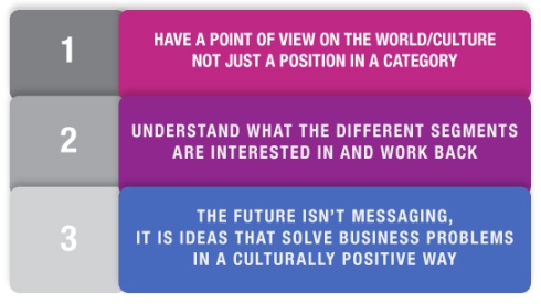
Recently I’ve been exploring the idea of brands needing to function as both enabler and filter for people in order to have a role beyond passive loyalty. They not only need a position within a market or category but must also have a clear and simple point of view on the world/culture in which they operate.

BRANDSINCULTURE

This evolving way we deliver and communicate is at the heart of the opportunity for mobile networks and technology providers in light of their move to become the enable and the filter for people’s social peripherial vision and networks.

But what will the work need to look like?

Technology lets the crowd raise-up the things it likes with links and tags and re-posts, and damn the things it doesn’t like with a pointed lack of attention. Old passive message, big idea, objective correlative creative with a big call to action, and series of key frame proof points doesn’t cut it anymore. There is too much noise: now things have to be good enough to share.

But just because something is good enough to share or inherently interesting doesn’t mean it will catch on and spread through networks. The work itself must be implicitly structured for the network (as illustrated by SharedEgg) and stimulate the growth or reshaping of the network, not just have an AddThis or send to a friend button.

  • It must contain an idea that can be reprocessed and played with, passed on and owned.
  • It needs to be an idea that people can use but not be completely dry and functional.
  • It needs to provides more than the (important) phatic entertainment and brand story BUT ALSO vital real world reward and social currency.
  • It must allow the crowd to create nodal points* within their part of the network.

Mobile is the tangible, first thing you see in the morning, last thing you check at night, always with you object, that will enable people to pull their networks and these smaller, higher frequency, locally relevant ideas together so that they can create their own digital nodal points or experience their friends’ ones while on the move.

This is why the work we do needs to be good enough to share with everyone, anywhere.

———————————————–

* If we can think of a Nodal Point as a (potentially distributed) collection of content, conversations and links that spread a meme/concept and cause the ideas, experiences and other journeys around it to be reshaped and “dragged” (just like a planet’s mass influences the passage of time around it), then it is a key point in an interactive experience or someone’s digitally enabled life.

Social Media monitoring and the spectrum of online relationships

1 Oct

I got talking to the COI the other day about online PR, Word of Mouth and Social Media and the conversation turned to the problems of ROI and monitoring.

I’ve sat in too many Social Media presentations that promise a bit about ROI at the end but instead of a practical approach just mention “the power of conversations”, list a few free tools and then mention one of the larger monitoring services.

Unfortunately despite people intuitively knowing that the social and consumer-centric business approach is the future for marketing and communications, this won’t convince a CFO or the global board. They like models and numbers.

So off the back of this I took an earlier post based on some of Mike Arauz’s thinking and started to try and categorise the numerous, different monitoring techniques out there to make comparing like with like more possible.

Anyway here goes…

An approach to Social Media Monitoring and measurement based on the spectrum of online relationships

Increasingly the value of an idea is not in its initial direct exposure, blog mention or spot/insertion in a publication, but in the value or social currency it provides to the audience. This social oxygen value enables the idea to spread socially.

Social Media campaigns are uniquely measurable but not all measures are equal and indicate true effectiveness. Different social media actions or online conversations have different values and influences upon consumer behaviour.

Multiple metrics, from number of followers and fans, to positive or negative sentiment, to reposts and influencer mentions, can be difficult to distinguish from one another. In effect we can become trapped in a state of analysis paralysis where there is too much social media data and too little understanding.

An agreed industry standard is needed but, until a consensus arises, we have developed a structure to categorise the value of different monitoring tools/metrics and start building an measurement and tracking model.

Fig. 1

fig. 1 – Spectrum of Online Relationships

By classifying social media conversations into three categories – Exposure, Engagement, Collaboration – based on the Spectrum of Online Relationships that underpin them (fig 1), we can group their associated metrics and monitoring approaches (fig 2). Then by examining the overall performance of the activity in each category we can begin to establish the effectiveness and conversion rate of social media campaigns and ongoing activity.

The idea is to simplify all the different effectiveness measures out there so comparisons/trends can be made and then these can then used alongside true Social ROI calculations.

Fig. 2 - Social Media ROI Metrics and Measurement Techniques

fig. 2 - Social Media Monitoring, Metrics and measurement tools by category

Categorising social media activity this way means it is possible to take a holistic approach and use aggregates of the different monitoring techniques – and metrics that will vary according to the nature of every campaign and its platform type – to compare the performance between each category and hence work out the relative success of the social media activity. The ultimate goal of this approach is to be able to compare the effectiveness of different social media campaigns when comparing like with like is often difficult.

Using this structure means that the results of the Exposure, Engagement and Collaboration categories can be compared to identify performance and trends.

I’ve arrange an example of this way of thinking as an equation (which is sure to attract the wrath of Anna O’Brien who rightly points out the falseness of the different social media “ROI metrics” and silly equations out there) but it is not meant to be a magic bullet or mathematically sound – it is a visual way of structuring thinking about the principles at play.

For example, one measure of a social media campaign’s momentum – Social Media Traction – would be to compare the ratio of Engagement performance to Exposure performance (Fig 3) where a +1 would indicate success and social media momentum as people moved from being merely exposed to a campaign to becoming more engaged.

Any measure/inputs of Exposure or Engagement (or even Collaboration) would differ for each campaign and organisation – as I said earlier the idea is to simplify the different effectiveness measures and monitoring techniques so comparisons can be made and trends identified.

fig. 3 – A way of thinking about a campaign’s traction by comparing performance in the Exposure and Engagement categories

fig. 3 – A way of thinking about a campaign’s traction by comparing performance in the Exposure and Engagement categories

Equally using this approach to define Social Media Conversion and Advocacy would require a focus on activity and metrics within the Collaboration category. Indeed, the ratio between Engagement performance and Collaboration performance could be seen as being an indicator of people moving from discovering, sharing and “playing” with content to acting upon it – whether making it their own passion or hopefully even changing purchasing behaviour.

Ultimately this proposed approach to Social Media monitoring/measurement will need to be linked back to ROI. Can we prove whether good results in either category – or a good Social Media Traction or  Social Media Conversion and Advocacy score – can relate to a lower Cost per Acquisition or an increase sales?

This will require someone much better at maths than me but I believe that some agreed structure and model is vital to proving the long term value of social media and the real web to the board and CFO.

Infographic for tea and coffee drinkers

10 Sep

A little creative reminder I knocked up for the office kitchen…

coffee_graph

Spectrum of online relationships diagram

8 Sep


Spectrum of Online-based Relationships

Spectrum of Online-based Relationships

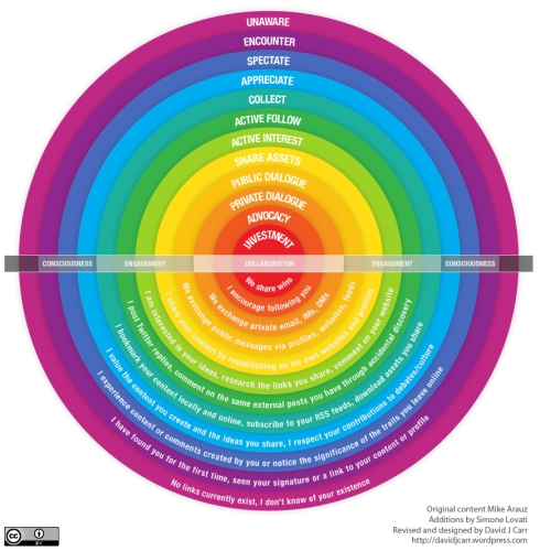
Back in April Mike Arauz published his excellent Spectrum of Online Friendship that I’ve since been using to describe some of the strong and weak bonds that exist between people in the real web versus the marketing web. 

However, I started overlaying some additional information such as the volume of relationship types, weaker connections that exist before both parties are mutually aware of each other and even the general timeline phases of the relationships*. And I was doing it in Powerpoint and Keynote. And it was ugly and confusing. So I got Illustrator out to do one of my diagrams.

And this is the result. Hopefully you like it and can use it.

The thinking credits go mostly to Mr Arauz and also to Simone Lovati who suggested some additions in the comments on Mike’s original post (who says comments are full of Spam and poor spellers).

I just added a bit, rearranged some flows and made it look (hopefully) pretty.

*Just to note, these are relationships that begin online as opposed to through physical, traditional friendships or acquaintance.

——–Update———

I’ve built on this now to explore how we can measure activity within the different categories of activity

Social Media monitoring and the spectrum of online relationships